
All this year, I’ve been looking back at my experience in 2015 when my debut novel, Husband in Hiding, was accepted for publication.
My last installment discussed the taxing yet rewarding process it was to work with a professional editor for the first time. After I finished that, I thought it was going to be smooth sailing from then to the release. My small publisher didn’t put many demands on me in the way of marketing, so my plate was pretty empty. I tried to implement some of my research about marketing, but in retrospect, it was nothing like I should have been doing.
As I shared in my first post of this series, one of the factors that steered me away from self-publishing was the need to hire a cover artist. Thus, one of the thrills I eagerly awaited was getting to see what kind of cover my publisher and his artist would come up with. To my surprise, I didn’t have to wait long, receiving a rendering within weeks of signing my contract.
I adored what they decided on, even though it wasn’t my original vision. They based it off of the protagonist, Wes, having to retreat into a safe house provided by the witness protection program. It had the front door and a porch area, with a mysterious tone to it. The first time I saw it, I had to pinch myself over the amazement of having my name on such a beautiful cover.
Once all of the editing was finished, my publisher let me know his next step was requesting a proof copy. Unfamiliar with the process, I thought of it in terms of getting pictures taken and receiving the proofs, which are typically almost as good as the actual photos. It seemed like a mere formality, so I didn’t really worry about it. Instead, I was focusing on the big release, debating whether or not to have a book launch party.
Before long, this last step became a major dropoff. My publisher informed me that the proof didn’t meet their expectations in one way or another, meaning they had to go back to the drawing board. Because of their small size and limited resources, they were reluctant to invest in another cover and suggested we just keep it to the title over a black backdrop.
I understood their position and notion that the dark appearance would highlight the mystery’s covert vibe. Like a new mom, however, I had dreamed about my baby’s face for years, so my heart sank with disappointment over the proposal. I tried to focus on the upside, that it was still a published book, but I couldn’t overcome my disheartenment.
Still in love with the original concept, I suggested that they could add a door, even if it was just some white lines. They obliged me and tested it out, but they didn’t like how it turned out, either. After some debate, they decided to look into getting another one made. I was grateful beyond words for such accommodation.
Nonetheless, I was stressed for weeks about what the replacement would look like. I didn’t want to dislike it, in light of the pushback I gave over the plain black one. Not yet having a smartphone, I kept checking my email every hour or two, waiting for the reveal. When it came, I celebrated the unusual choice, again awestruck by this being a work of mine. Topping it off, they included the series logo I helped design.
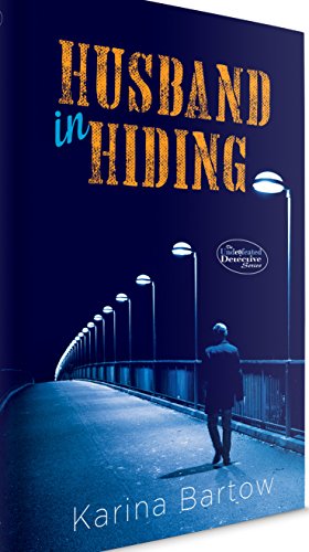
All said and done, I appreciated the experience even more. I still feel the end result embodies the story better than the first option or anything I could have envisioned. Because of everything the process entailed, I’ll always have a special feeling when I look at it.
Over the years, I’ve questioned whether I was out of line for voicing my opinion back then. With the two bigger companies I’ve worked with since, they’ve made it clear from the get-go that they can’t pander to each individual author’s tastes with covers, and I get that. If this had occurred later in my career or under another publisher, I’m uncertain how I would’ve handled it.
What I can say, though, is that I showed respect and cooperation, which have served me very well in my subsequent business relations. Difficulties of various sorts are bound to creep up now and then, and sometimes, you have to go to bat for yourself. Even so, that doesn’t mean you have to take the heaviest one. Choosing a light, cheery wiffle bat will usually help your argument better than a solid wood Louisville Slugger™. Trust that the publisher wants your book to be as successful as you do, and endeavor to work with them to make that happen.
With that behind me, what other curve balls could come my way? Find out in the final installment.
Up Next>
Defining a Decade: The Revolving Release~Coming in December
<Previously
Defining a Decade: The First EDITion

2 thoughts on “Defining a Decade: The Cover Conundrum”